
The Hourly Data Dashboard provides a high-resolution view of when your customers are most active. By visualizing performance by both the hour of the day and the day of the week, you can make informed decisions about Dayparting—adjusting your bids to be more aggressive during "peak" periods and pulling back when activity is low.
⚠️ Integration & Access Notes
Before using this dashboard, please keep the following requirements in mind:
Selling Partner Token: To access these analytics, sellers must have their Selling Partner Token connected. If you encounter an error message, please double-check that your token is correctly linked in your account settings.
Vendor Accounts: If you are an Amazon Vendor, you may encounter a "Product Performance Unavailable" error message. This dashboard is currently tailored specifically for Sellers.
Favorite Your Products: Navigate to the Product Ad Data tab and click the ⭐ icon next to the products you want to track. The Hourly dashboard will only display products marked as Favorites.
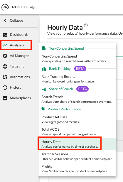
Accessing the Hourly Data Dashboard
Navigate to the Analytics tab in the left-hand sidebar.
Select Hourly Data from the dropdown menu.
Key Features & Insights
1. Hourly Heatmap
The center of this dashboard is a visual heatmap that maps out your performance across a 24-hour clock for every day of the week.
Color Coding: Darker green blocks represent higher volume, while lighter blocks indicate lower activity.
Toggle View: Use the View buttons at the top to switch the heatmap between Sales and Units.
Data Labels: Check the "Show Data Labels" box in the top right to see exact numerical values inside the heatmap blocks.
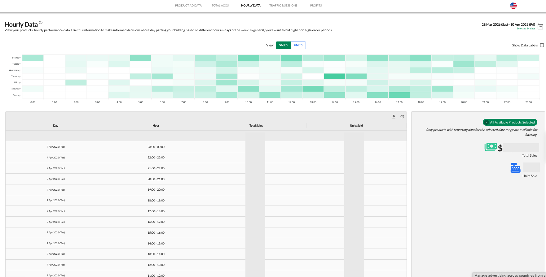
2. Performance Summary & Data Table
Below the heatmap, you’ll find a granular breakdown of your metrics:
Total Metrics: Quickly view your Total Sales and Units Sold for the selected period in the right-hand summary box.
Granular Table: The data table provides a chronological list of every hour, allowing you to see exactly how much revenue was generated in specific 60-minute windows (e.g., 20:00 - 21:00).
Strategic Implementation: How to Use This Data
The primary goal of the Hourly Data dashboard is to fuel your Dayparting Automations.
Identify Peak Hours: Look for clusters of dark green in your heatmap. In general, you’ll want to bid higher during these high-order periods to ensure your ads maintain top-of-page visibility when shoppers are ready to buy.
Spot "Dead Zones": Identify times of day with consistently zero or low sales. You may choose to lower your bids or "darken" your ads during these times to preserve your budget for higher-converting hours.
Weekend vs. Weekday: Compare your Sunday performance to your Monday-Friday trends. Many sellers find that "peak" hours shift significantly on weekends.
Customizing Your Analysis
Date Range Selection
Use the calendar icon in the top right corner to select your lookback window. A longer date range (e.g., 30 days) is recommended to identify consistent patterns rather than one-off anomalies.
Product & Marketplace Filters
Use the Global Filter (green button on the right) to drill down into specific products. Patterns can vary wildly between products—for example, a "Pre-Workout" supplement might peak in the early morning, while "Home Decor" might peak in the evening.
Ready to Automate? Once you’ve identified your peak hours, head over to Automations > Dayparting to set up rules that automatically adjust your bids based on these insights.
💬 Need Help?
Reach out to our Support Team anytime through the Live Chat bubble in the lower-right corner of the tool.